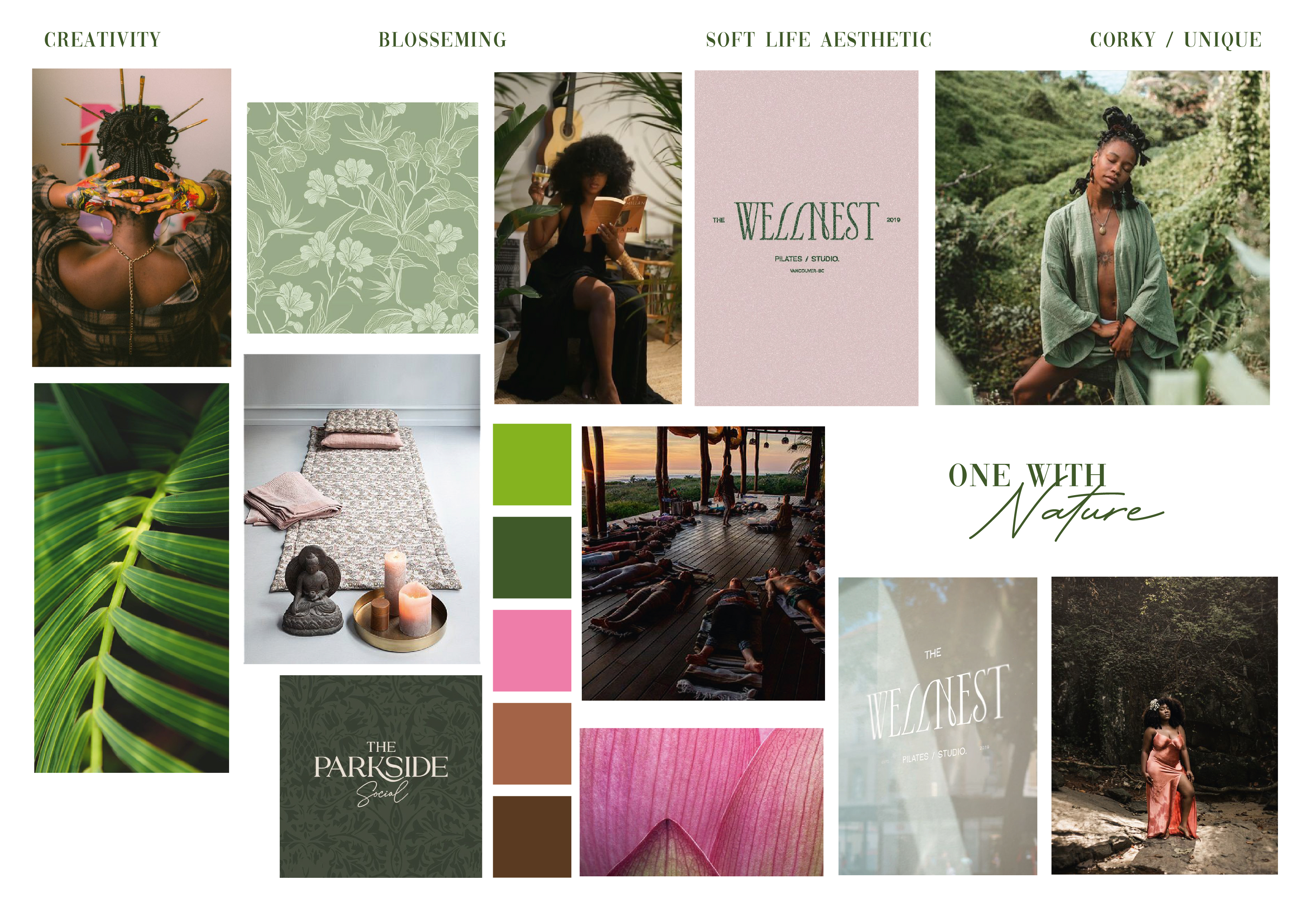
case study - Get Even Yoga
HER GOAL
Where she started
Zenobia's yoga practice was built on genuine passion and a growing, loyal community. However, she was doing most of her work pro bono — teaching for free while building a following that loved her, but wasn't yet paying her.
She needed a brand that could make the transition — from beloved community teacher to sought-after professional — feel effortless and earned.
PHASE 1 - ROCK SOLID FOUNDATION
Before any design began, we got strategic. Our discovery process uncovered a critical misalignment: Zenobia's existing brand was warm and approachable, but it wasn't signalling the professional, premium experience she was actually delivering.
Using our B.I.Z formula, we refined her brand message to specifically target dedicated individuals seeking a premium yoga experience — not casual drop-ins, but committed practitioners ready to invest in their practice.
PHASE 2 - DECIDE ON VISUAL DIRECTION
Zenobia didn't want a trendy brand; she wanted an authentic one. She chose to "Ground" her visuals.
The moodboard and resulting color palette were filled with earthy, natural tones, chosen to visually communicate the grounding nature of yoga — and to attract clients who were seeking exactly that feeling.
The final moodboard was a mix of two initial moodboard options.
Final moodboard
Color & pattern direction
PHASE 3 - FINAL DESIGNS
We translated the strategy into a full visual system:
Homepage using the new brand
Full website visual design
RESULTS
She has helped me take Get Even Yoga to the next level! Her vision, style, and creativity are unmatched. Thank you sis for all you've done, including designing my new website.
Zenobia (Founder Get Even Yoga)