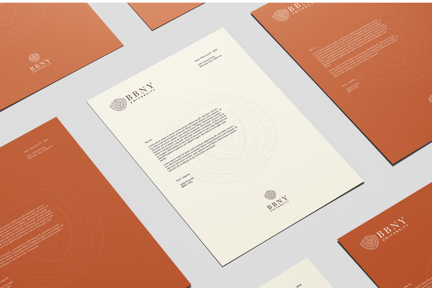
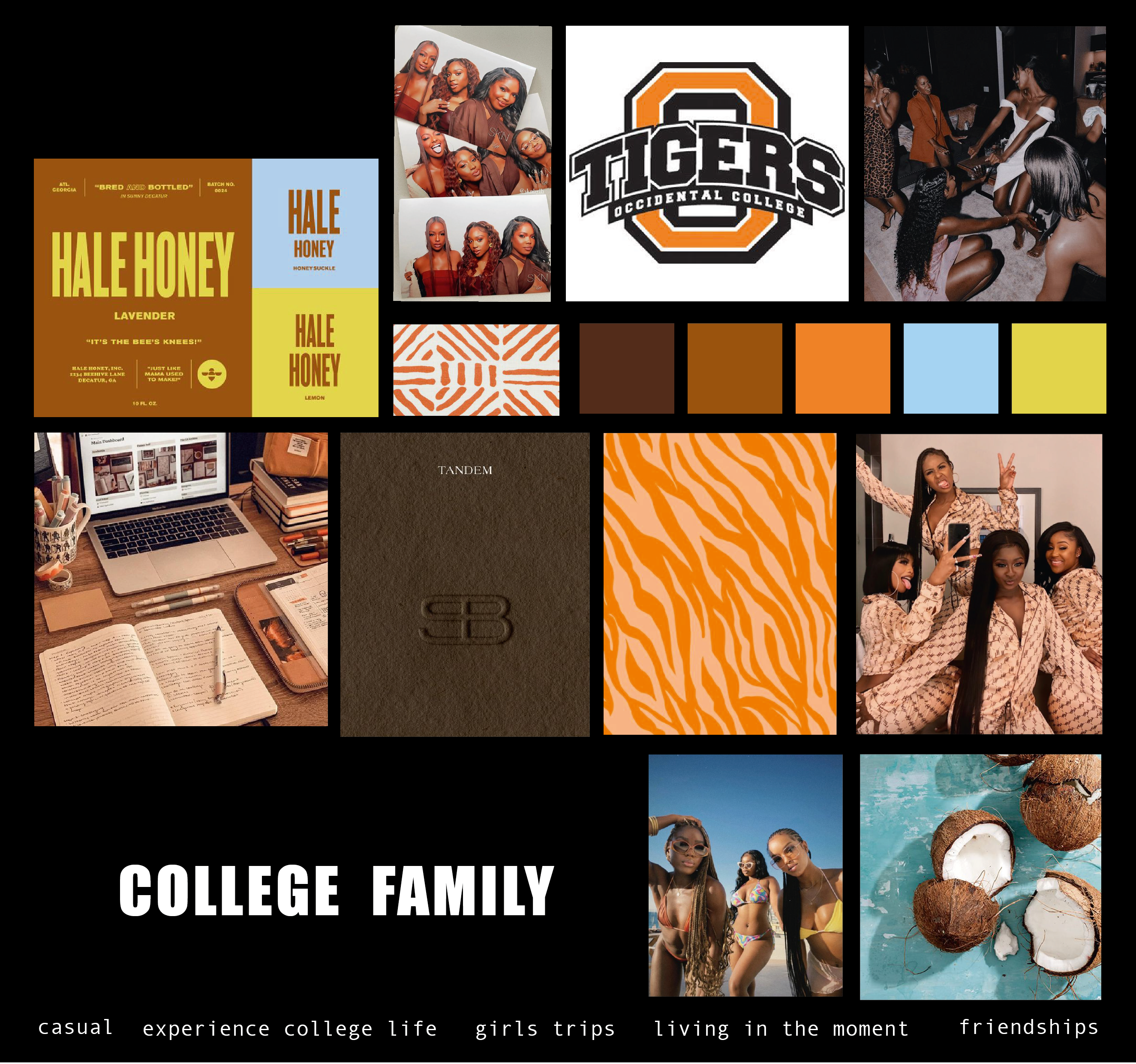
CASE STUDY - BLACK BEAUTY NEAR YOU
HER GOAL
Jaida founded BBNY University to create a vital sisterhood for students at Predominantly White Institutions (PWIs).
She had a clear vision but needed a brand that could act as a beacon, growing her online community and making every student feel seen, supported, and at home.
PHASE 1 - ROCK SOLID FOUNDATION
Before design, we solidified the strategy. The core insight was that BBNY wasn't just another student group; it was a "home away from home." Every branding decision would be filtered through this lens.
We refined the messaging to immediately communicate safety, community, and belonging, ensuring it would resonate deeply with students searching for their tribe in a large PWI environment.
PHASE 2 - DECIDE ON VISUAL DIRECTION
Jaida's brand needed to stand out with confidence and warmth. She chose the "Rebel" direction—not as an act of anger, but as a bold declaration of self-worth and community.
The visual identity became young, fresh, and dares to be different, using a vibrant pop of color to reflect the energy and joy of finding your people. This wasn't just pretty design; it was a visual handshake, telling students, "You belong here."
Final moodboard
Patterns & color combination
PHASE 3 - FINAL DESIGNS
We translated the "Nurture" strategy into a full visual system:
Custom made instagram templates
Letters from the BBNY
RESULTS
Thanks to these strategies my community is growing every month!
Jaida (Founder BBNY)
TESTIMONIALS